Knowledge Base Article
How to Design an Email Template With Sections
The Template Design tab of an email template is a visual builder. You build the email from sections, such as text, an image, a button or an event card, and stack them in the order you want. You can watch how it will look on a computer or a phone as you go.
Open it from Communication > Email Templates: click a template, or Add New, and go to the Template Design tab. The Subject and From Email Address sit above the builder, as before.
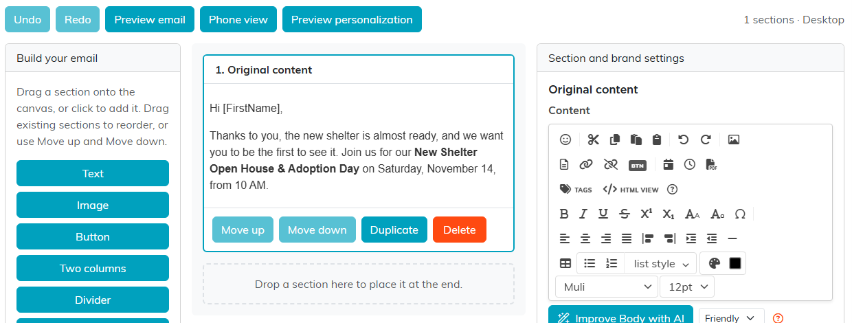
Three panels: the sections you can add on the left, your email in the middle, and the settings for the section you picked on the right.
Add sections
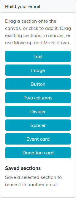
Build your email on the left lists the sections you can add: Text, Image, Button, Two columns, Divider, Spacer, Event card and Donation card. Drag one onto the email, or click it to add it at the end.
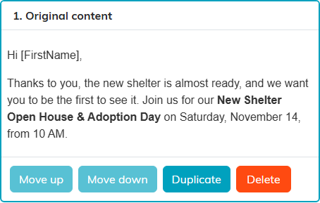
A template you made before the builder opens as one Original content section holding the email exactly as it was, so nothing is lost. Add new sections around it, or keep editing it in place.
Arrange sections
Click a section in the middle to pick it. Its buttons let you Move up, Move down, Duplicate or Delete it, and you can also drag a section to a new place. Undo and Redo above the builder step back and forward through your changes.
Edit a section
The section you pick opens in Section and brand settings on the right. Text, Original content, Two columns and the cards have the full editor, with Tags for merge tags and Improve Body with AI. Two columns gives you one editor for each column.
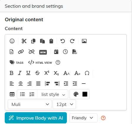
Below the editor, depending on the section, you set the button text and link, the picture (Choose or upload image picks one from your files or uploads a new one, and Alternative text describes it for people who cannot see it), the alignment, the section's background and text colors, and its padding. A Spacer has a height instead.
Event and donation cards
An Event card shows one of your events with a Register button. Search for the event under Event, then click Refresh card: Argenta fills in the event's name, date and time, location and description, and links the button to its public registration page. You see only events you have access to.
A Donation card does the same for your online donation form, with its headline, wording, picture and a Donate button that opens the form.
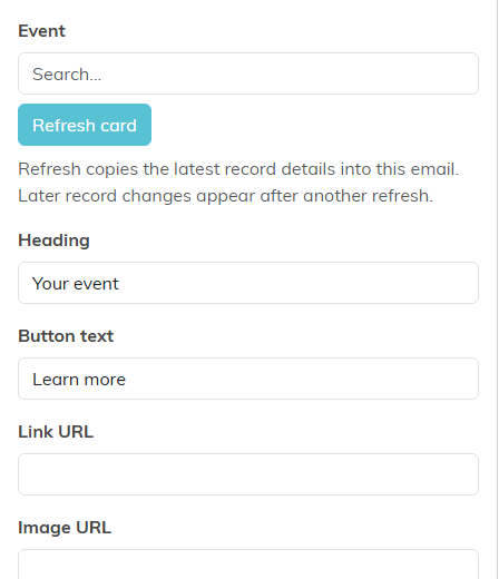
A card is a copy of the record as it was when you refreshed it. If the event or form changes later, open the template, pick the card and click Refresh card again. You can still change the heading, button text and wording yourself after a refresh.
Reuse a section
To use a section again in other emails, pick it, type a Saved section name and click Save reusable section. It appears under Saved sections on the left for everyone on your team; click Insert beside it to add a copy to any template. Delete beside a saved section removes it from that list; emails that already use it keep their copy.
Set your brand styles
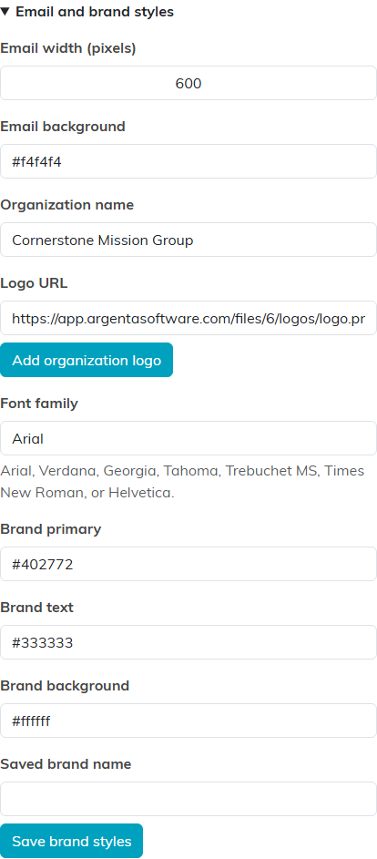
Open Email and brand styles at the bottom of the right panel to set the whole email's width, background color, organization name, logo, font and brand colors. Add organization logo puts your logo, centered, at the top of the email. To keep a look for next time, type a Saved brand name and click Save brand styles; it is listed below that button, and Apply beside it sets any template on your team to that look.
Preview it
Preview email shows the finished email without the editing frames, and Edit email takes you back. Phone view narrows it to a phone's width and Desktop view widens it again, so you can check both before you send.
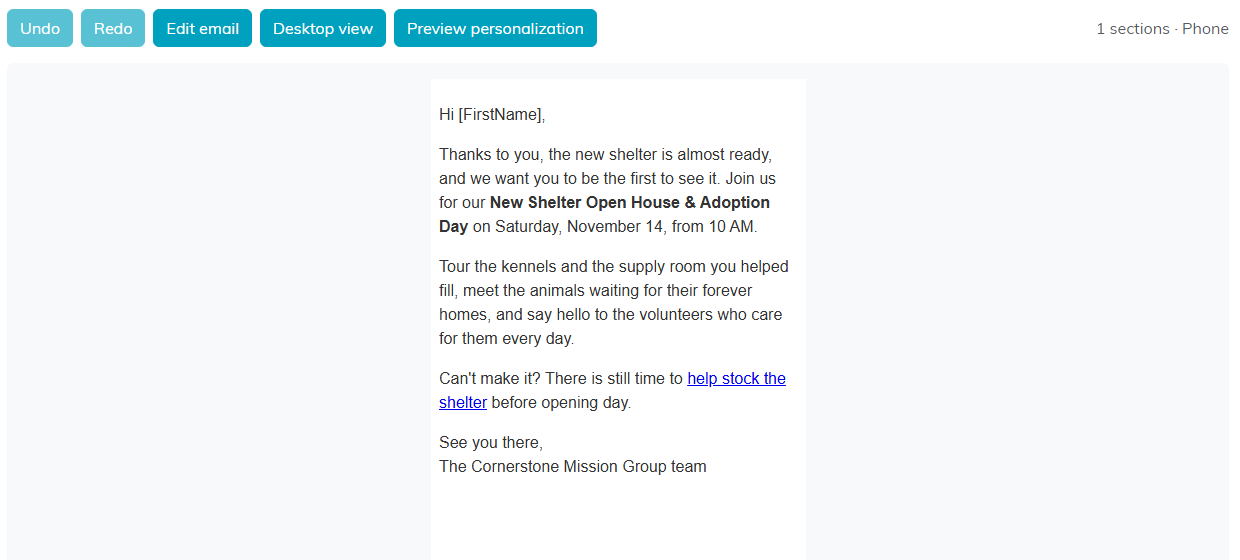
Preview personalization opens Preview As A Recipient below the builder: pick a person and click Preview to see the email with their merge tags filled in.
Save
The builder does not save on its own. Click Save All Changes to keep working, or Save All & Exit Record to finish. When it is ready, Use This Template saves it and opens it on the Compose Email page to send.
For more on templates, see How to Create an Email Template and What is the Email Template Workspace?